Brand guide · version 1.0
Your keys.
Your gold.
Zeltis is the self-custody money app. This page holds everything needed to show the brand the same way everywhere: logo, colour, type, components and voice.
The idea
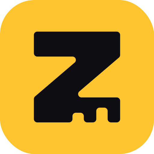
A Z that is also a key
The name comes from the Latvian word zelts, gold. The mark is a bold letter Z whose base is cut like the teeth of a key. One shape says both things the product stands for: this is Zeltis, and you hold the keys.
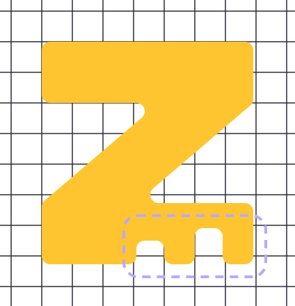
The teeth are cut into the letter instead of hanging below it. The mark keeps a compact, almost square outline, so it stays a clear Z at 16 pixels and fills an app icon well.
Logo
One mark, one wordmark, two lockups
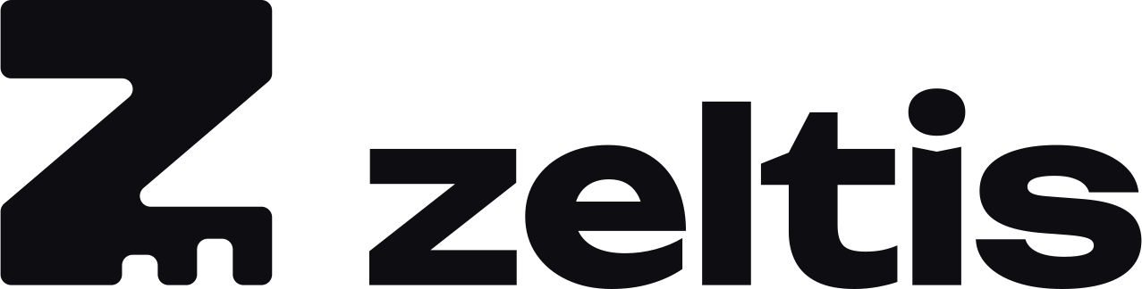
The wordmark is always lowercase zeltis, set in Unbounded Bold and supplied as outlines, so it looks the same on every device. Use the horizontal lockup by default. Use the stacked lockup when the space is square. Use the mark alone where the name is already clear, such as the app icon.


Clear space
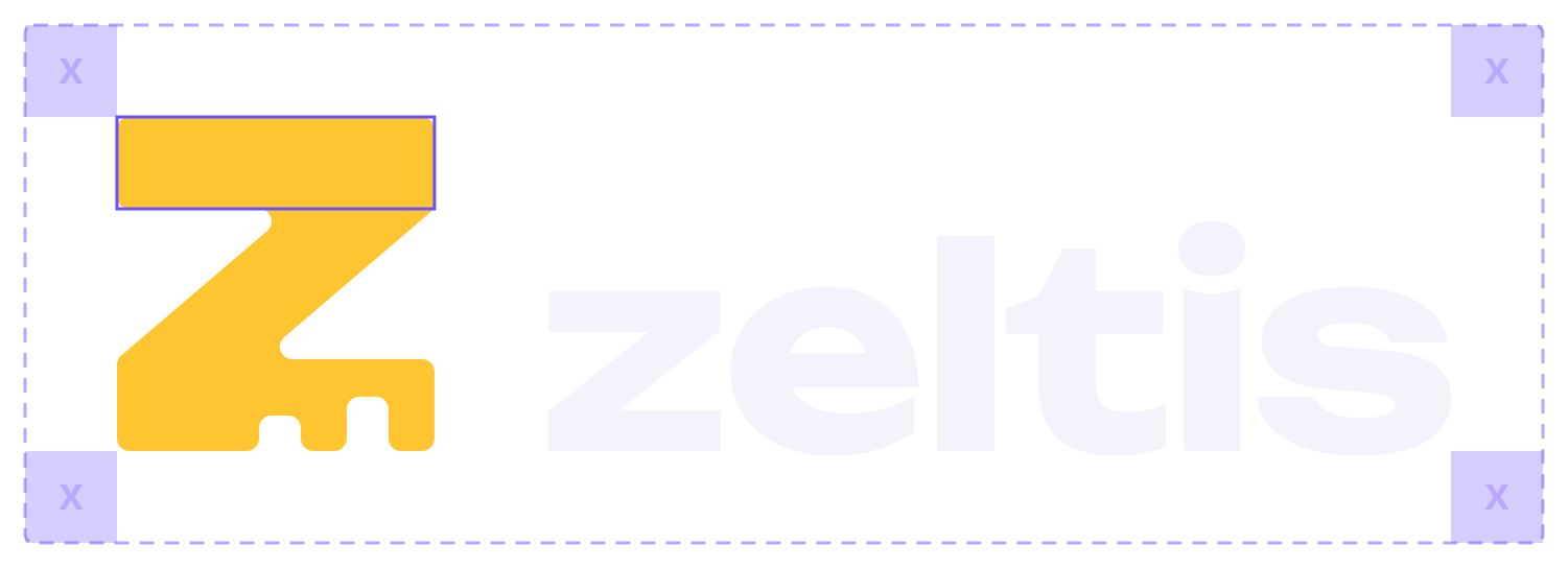
Keep a free zone of x on every side of the logo, where x is the thickness of the top bar of the Z (27.5% of the mark height). No text, edges or images inside this zone.
Minimum size
- Horizontal lockup: 96 px wide on screen, 25 mm in print.
- Stacked lockup: 64 px wide on screen, 18 mm in print.
- Mark alone: 16 px. Below 24 px use the favicon tile.

Colour
Gold on ink, with ultraviolet
Zeltis is dark-first. Gold carries the name and every primary action. Ultraviolet is the second voice: focus, links and highlights. Cream is for the few light sections. Text on gold is always ink.
Core
#0E0D12--z-inkPage background. Text on gold.#FFC531--z-goldBrand. Primary buttons.#F2A900--z-gold-deepHover and pressed gold.#6B4EFF--z-violetFocus ring. Links on light.#B9A8FF--z-lilacLinks and soft accent on dark.#FFF8E7--z-creamLight sections.Surfaces and text
#17161D--z-nightCards and panels.#201F29--z-night-2Raised surfaces.#2D2B38--z-lineDividers on dark.#F4F2FA--z-textText on dark.#9A97A8--z-mutedSecondary text on dark.#5E5B6B--z-muted-lightSecondary text on cream.Status and helpers
#22D3A0--z-mintPositive, money in.#FF5A5F--z-coralErrors and alerts.#0B7A5B--z-mint-deepPositive text on light.#C8323A--z-coral-deepError text on light.#74718A--z-line-strongInput borders on dark.#FFFFFF--z-paperCards on cream.How to use it
- About 80% ink and night, 15% text, 5% gold. Gold is rare, so it stays strong.
- One gold button per screen: the main action.
- Violet marks focus and links. It is not a background for long text.
- Mint and coral report a state. They are never decoration.
- No gradients, with one exception: the gold-to-violet glow behind a hero.
- Colour never carries meaning alone. Add a word, a sign or an icon.
Contrast
| Pair | Ratio | Use |
|---|---|---|
| Text on ink | 17.5:1 | All text |
| Gold on ink · ink on gold | 12.2:1 | All text |
| Ink on gold deep | 9.6:1 | All text |
| Lilac on ink | 9.3:1 | Links on dark |
| Muted on ink / night / night 2 | 6.8 / 6.3 / 5.7:1 | All text |
| Mint on ink · coral on ink | 10.0 · 6.3:1 | All text |
| White on violet | 5.1:1 | All text |
| Violet on ink | 3.8:1 | Focus ring, icons, text from 24 px. Not body text |
| Ink on cream | 18.3:1 | All text |
| Muted light on cream | 6.2:1 | All text |
| Violet on cream | 4.8:1 | Links on light |
| Gold on cream | 1.5:1 | Never as text or thin lines. Fill only, with ink text |
| Mint · coral on cream | 1.8 · 2.9:1 | Use mint deep and coral deep (5.0:1) |
Body text needs 4.5:1, large text and interface parts 3:1 (WCAG 2.2, level AA).
Typography
Unbounded speaks, Inter explains
Aa Zz 09
Unbounded
Display face. Headlines, the wordmark and big numbers. Weights 500 to 800. Tracking −0.02 em. Not for paragraphs or labels under 18 px.
Aa Zz 09
Inter
Interface and body face. Weights 400, 500 and 600. Line height 1.55 for paragraphs. Amounts use tabular figures so columns line up.
Money you hold
Spend from your own wallet
One price before you confirm
Card settings
€1,240.50
Your crypto stays in your own wallet until the moment you pay.
You see the rate and the fee in one number before you confirm an exchange. Nothing is added afterwards.
Crypto-assets are volatile. You can lose money.
Available balance
LV80 DEMO 0000 4351 2210 7 · 0x71C7…976F
Components
Round, calm, easy to hit
Buttons are pills, 48 px high. Fields and cards use radii from 16 to 28 px. Keyboard focus is a 2 px violet outline, always visible. Styles live in components.css.
On dark
We use it only to tell you when Zeltis opens.
Use a dot for decimals, for example 12.50.
On cream
Use a dot for decimals, for example 12.50.
Words
Slogan, descriptor and voice
Slogan
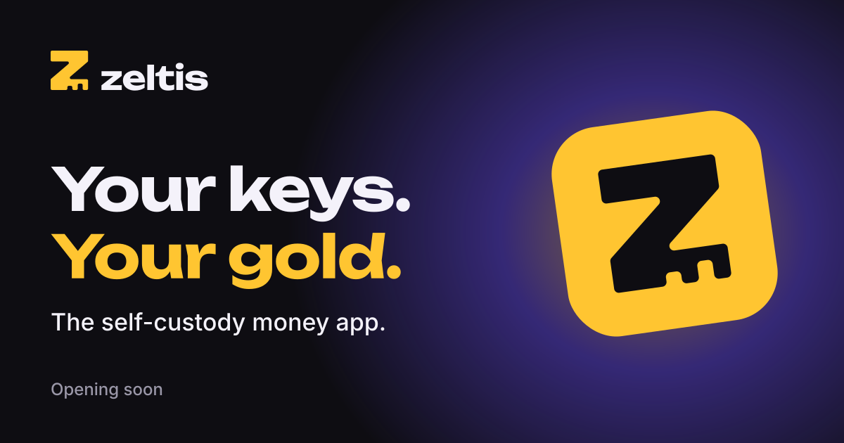
Your keys. Your gold.
Always two sentences with full stops. Never translated, never extended. It can stand alone under the logo or as a headline.
Descriptor
The self-custody money app.
One line that says what Zeltis is. Use it where the slogan needs an explanation: store listings, link previews, the first line of an introduction.
How to describe the company today
Zeltis SIA is a company in formation. It plans to apply to Latvijas Banka for authorisation as a crypto-asset service provider. Services are not available yet.
Use this wording whenever the status of the company comes up. Do not shorten it into a claim.
Voice
- Short. One idea per sentence.
- Direct. Say what happens and what to do next.
- Confident. No hedging, no shouting.
- Friendly. A person talking to a person.
Write
- Your crypto stays in your own wallet.
- You see one price before you confirm.
- Payment declined. The card is frozen. Unfreeze it in Card settings.
- Join the waitlist. We will email you when we open.
- Crypto-assets are volatile. You can lose money.
- The card and the euro account follow the rules of the partner that provides them.
Avoid
- Hype words: revolutionary, seamless, next-gen, game-changing.
- Vague errors: “Oops! Something went wrong.”
- Pressure: “Don't miss out”, countdowns, fake scarcity.
- Calling Zeltis a bank, or describing it with words that imply a licence, state protection of funds or a promised result.
- Promises about prices, returns or rewards.
- Promises that money can never be held or checked. Partner rules apply to the card and the euro account.
- Emoji and exclamation marks in interface text.
Logo rules
Do and don't
Pay anywhereZeltisApp icon and favicon
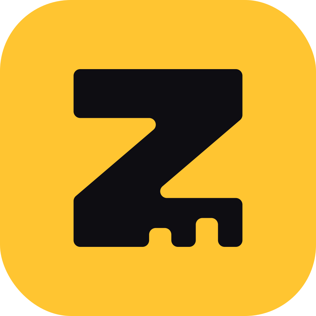
Ink Z on a gold tile
The app icon is a full gold square with the ink mark at 53% of its width. Phones round the corners themselves, and the mark stays inside the safe zone of adaptive icons. The favicon uses a larger mark, 66% of the tile, so the Z survives at 16 px.
Files
Download
SVG files are the source. PNG copies of the lockups are in the png folder. All shapes are outlines, so no font is needed to show the logo.
Logo
- logo-horizontal.svg primary, on dark
- logo-horizontal-on-light.svg on cream or white
- logo-stacked.svg on dark
- logo-stacked-on-light.svg on cream or white
- logo-mark.svg gold mark
- logo-mark-tile.svg mark on gold tile
- logo-wordmark.svg wordmark, light
One colour



Icons and code
- app-icon.svg 1024, full square
- app-icon-1024.png also 512, 192, 180, 32
- favicon.svg also .ico, 32, 16
- og-image.png 1200 × 630
- tokens.css design tokens
- components.css buttons, fields, badges
- fonts/fonts.css Unbounded and Inter